How a 48-Year-Old Icon Became
Generic Corporate Slop Overnight
What brilliant MBA genius at Cracker Barrel headquarters looked at nearly five decades of brand recognition and thought, “You know what this needs? Complete annihilation”?
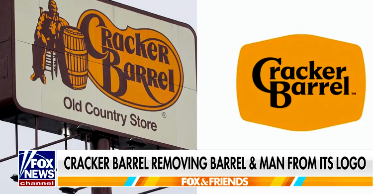
The restaurant chain just stripped away their iconic old man resting on a barrel—a symbol that has graced their logo since 1977—and replaced it with… text. Just text. That’s it. That’s the big $700 million “transformation.”
Let’s be crystal clear about what happened here: Cracker Barrel took a logo that instantly evoked rustic Americana, country comfort, and down-home authenticity, and threw it in the corporate blender with every other sanitized, focus-grouped brand identity choking the marketplace. The result? A logo so bland it could moonlight as a grocery store house brand.
Fox News: Cracker Barrel’s new text-only logo is ‘how you destroy a brand,’ critics claim
Cracker Barrel’s new logo was accused by conservative critics of being the company’s “Bud Light” moment after receiving intense online backlash, while CEO Julie Felss Masino contended the response has been “overwhelmingly positive.”
The company unveiled the new logo on Tuesday as part of its new branding campaign for the Cracker Barrel Old Country Store restaurants. The campaign eliminated the iconic image of a man resting on a barrel in favor of a text-only logo for the first time since 1977.
According to a company press release, this new logo is still “anchored in Cracker Barrel’s signature gold and brown tones” and “now rooted even more closely to the iconic barrel shape and word mark that started it all.”
However, many social media users disagreed, particularly on the right, claiming the new logo was “dull” and destroyed the point of the brand.
“They took away the cracker and the barrel. What even is the point now?” radio host Jesse Kelly asked.
The Stock Market Delivers Swift Justice
The market’s reaction was immediate and merciless. Shares nosedived more than 12% in Thursday trading, with some reports indicating CBRL stock sank 10% on the day of the logo reveal. Investors weren’t just disappointed—they were fleeing.
And why shouldn’t they? This isn’t just a logo change; it’s a masterclass in corporate self-sabotage. When a company voluntarily destroys 48 years of brand equity in pursuit of some misguided “modernization,” what does that say about their decision-making capabilities? If they’re willing to torch their most recognizable asset, what other brilliant moves are they planning?
CNN Business: Cracker Barrel stock tanks after unveiling a controversial logo change
New York
—
Cracker Barrel’s modern makeover doesn’t stop with redoing its restaurants. It’s dropping the barrel and the man from its logo, too.On Tuesday, the Southern-inspired casual dining chain unveiled a new logo “rooted even more closely to the iconic barrel shape,” but without the barrel itself — a central part of the brand’s identity since 1977. (As for the the barrel itself, it was “essentially the water coolers of the day,” Cracker Barrel explained in a blog post.)
Shares of Cracker Barrel (CBRL) nosedived more than 12% in trading Thursday.
The Bud Light Moment Nobody Asked For
The backlash has drawn comparisons to the Bud Light controversy, with conservatives raging against what they perceive as another corporate betrayal of traditional values. Whether you agree with that sentiment or not, the parallel is instructive: companies that alienate their core customer base for nebulous “modernization” goals often find themselves learning expensive lessons about brand loyalty.
Cracker Barrel built its empire on nostalgia, tradition, and the promise of consistency in an ever-changing world. Their restaurants are shrines to Americana, stuffed with antiques and memories. Their customers didn’t come for cutting-edge design—they came for the opposite. They came for the old man on the barrel.
The Deeper Disease
This logo debacle is merely a symptom of a more serious corporate illness: the delusional belief that heritage brands need to chase trends to survive. The new logo “adopts a minimalist approach concurrent with the times”—as if being “concurrent with the times” should be the goal of a restaurant chain whose entire value proposition is timeless comfort.
Someone in Lebanon, Tennessee, convinced themselves that what Cracker Barrel really needed was to look like every other sterile tech startup or subscription service cluttering our phones. They traded character for conformity, distinctiveness for dullness.
EXCLUSIVE: Cracker Barrel Insider Breaks Silence on the Woke Destruction of an American Institution
Erik Russell spent nearly 10 years working at Cracker Barrel. He’s done every job in the restaurant. Erik even met his wife there. To Erik, Cracker Barrel was a place where… pic.twitter.com/YDolLTs3dW
— Benny Johnson (@bennyjohnson) August 21, 2025
The $700 Million Question
This logo change is part of a larger $700 million transformation plan to shake off their “stodgy image.” Seven hundred million dollars! Imagine the shareholder meetings where executives will have to explain how they spent that fortune making their brand less recognizable, less memorable, and less authentic.
The cruel irony? In an age of generic everything, “stodgy” was their competitive advantage. While every other chain races toward bland uniformity, Cracker Barrel owned authenticity. Owned it, and then threw it away.
The market has spoken. The customers have spoken. Even the logo itself seems to be screaming in minimalist horror at what it’s become. But hey, at least it’s “concurrent with the times.”
Congratulations, Cracker Barrel. You’ve successfully transformed 48 years of brand recognition into 48 hours of brand destruction. The old man on the barrel is gone, but his ghost will haunt your stock price for years to come.
